Blog
Why we joined the Dark Side..
An insight on why and when to use Dark User Interfaces
There has been a lot of debate on what’s better for the user, a Light coloured interface or a Darker one. Some suggest it depends on the type of application, whereas others think its merely a preference. At locus.sh, my task was to design a dashboard to help operation managers track their on-ground fleet. This means an interface full of lists, tables full of data, search, sort, filters and most importantly maps with a lot of pointers over it.
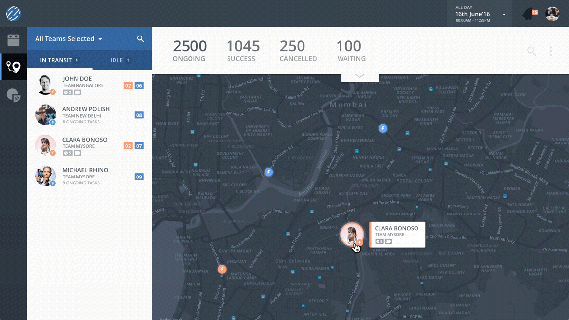
This is a dashboard which people are going to use for hours at a stretch for continuous monitoring. The interface had to be pleasing to the eye, but no compromise should be made with legibility of the characters or to the visibility of its functions.
So we decided to break it down, we analysed the pros and cons of both the schemes on the basis of the following aspects:
- Readability:
This refers to the users ability to perceive text in the interface easily. After some research we found a study which proved that when it comes to text, black text over white background has the highest readability. So since our dashboard is content intensive, it was a no brainer on what to do.
- Clarity:
This is the aspect where the user can easily grasp all the elements and information your interface wants to portray without any effort. This dashboard’s main function is to let a client track its delivery fleet on the map. We were using default google maps for this purpose in the past but when there are a lot of pointers and poly-lines on that, it was impossible for the user to understand what’s going on. Whereas by a little testing we realised using a darker coloured map actually improves the visibility of the elements over it.
- Aesthetics:
Even though this aspect is not of the highest priority, in my point of view a good user interface should definitely be attractive. Good aesthetics make sure that your users enjoy using your interface. Our dashboard is something people are gonna keep viewing all day, we had to make sure they find it visually appealing. In this respect a darker scheme can make your interface look sophisticated and professional whereas a lighter one makes it look lively and establishes a friendly connect with the user. It was a crucial call to decide how we want our users to perceive our product, so we decided to look at it from their perspective.
- Who is the user:
So this dashboard is basically gonna be used by Operation Managers who are used to working with primitive route tracking softwares where there was no real focus on design. Also in a country like India, there are a very few Ops managers who are tech-savvy. So designing a dark interface which looks too sophisticated can overwhelm them and they might not be very comfortable to start using it. Hence we needed an interface which looked lively and easy to get started with, but not so bright that they burn their eyes by staring at it all day.
After analysing this it was clear that choosing a colour scheme for our product was not gonna be as binary a decision as we thought it would be. Due to the varied nature of elements in our dashboard we had to create a hybrid interface with both dark and light elements and finally balance it to make it aesthetically pleasing, i.e. Make it light enough for people to love it, but dark enough that there is right focus on the elements.
After a couple of beers and making a lot of star wars references about the light and dark forces, We finally figured it out.
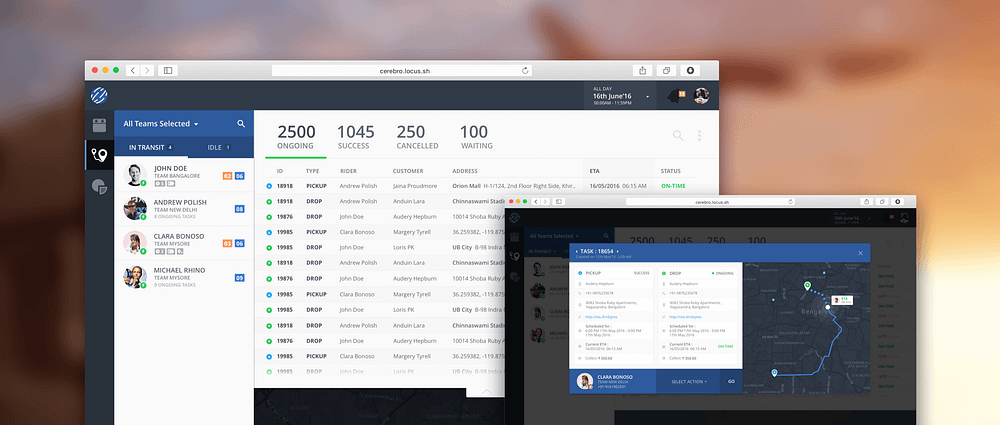
Each element in the dashboard was designed keeping the clarity and readability in mind. All the lists and tables were designed on a light theme and for the maps we designed our own dark theme.
Being a very data intensive dashboard, it was a very challenging task to be concise about the data we were displaying yet provide all the information to the users. We colour-coded all the statuses and used interactive icons to help the users understand the data in a glance.
To conclude we are pretty happy with the way our design turned out to be, and are really excited to roll it out to our clients. We hope that the balance we found in our interface actually helps our users to manage and track their delivery fleet, easily and efficiently.
Follow us on linkedin for upcoming designs updates. Reach us at Locus.

This post was authored by: Vaibhav Bhasin

Route Optimization
Mapping the world – Easy Address Geocoding
Jul 28, 2016
Enter current address. Enter Destination. Done! Whether you are checking out a new restaurant across the town or driving cross country to meet your loved ones, finding the exact location of any place and the most optimal way to get there has never been easier. One of the most ubiquitously used map service app, ‘Google […]
Read moreMOST POPULAR
EDITOR’S PICKS
SUBSCRIBE TO OUR NEWSLETTER
Stay up to date with the latest marketing, sales, and service tips and news
Why we joined the Dark Side..